Terminal Gui's Built-in Views
Terminal.Gui provides the following set of built-in views and controls for building terminal user interfaces:
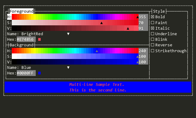
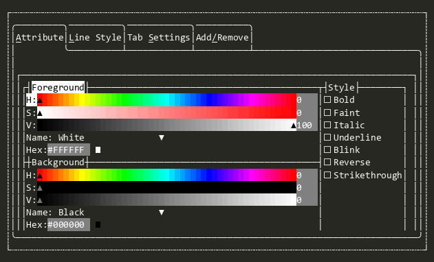
AttributePicker
Allows the user to pick an Attribute by selecting foreground and background colors, and text styles.
Bar
A container for Shortcut items that arranges them horizontally or vertically. Serves as the base class for Menu, MenuBar, and StatusBar.
Button
Raises the Accepting and Accepted events when the user presses HotKey, Enter, or Space or clicks with the mouse.

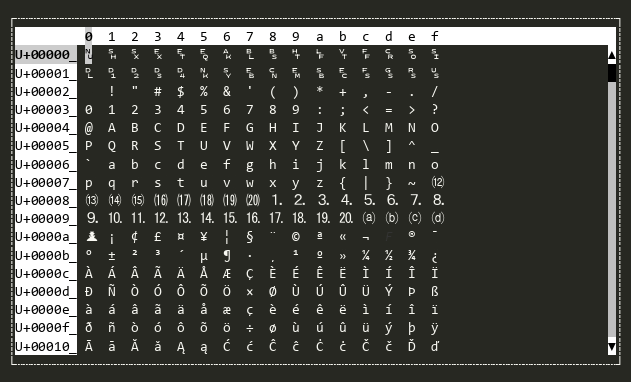
CharMap
A scrollable map of the Unicode codepoints.
CheckBox
Shows a checkbox that can be cycled between two or three states.
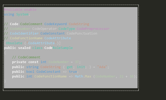
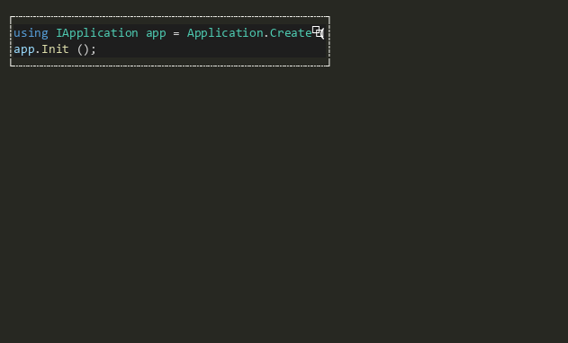
Code
A read-only view that renders syntax-highlighted source code.
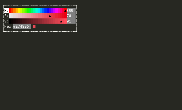
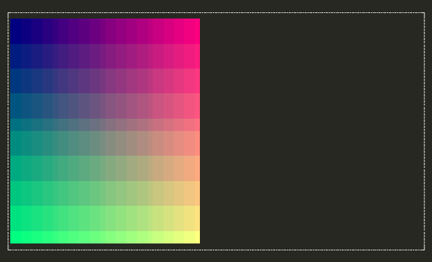
ColorPicker
Color Picker supporting RGB, HSL, and HSV color models. Supports choosing colors with sliders and color names from the IColorNameResolver.
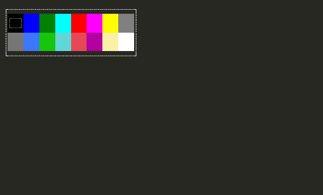
ColorPicker16
A simple color picker that supports the legacy 16 ANSI colors.
DateEditor
Provides date editing functionality using TextValidateField with culture-aware formatting.

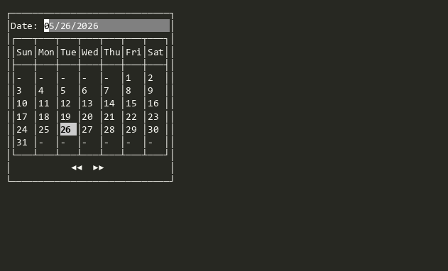
DatePicker
Lets the user pick a date from a visual calendar.
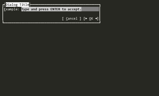
Dialog
A modal dialog window with buttons across the bottom. When a button is pressed, Result is set to the button's index (0-based).
Dialog<T>
A generic modal dialog window with buttons across the bottom. Derive from this class to create dialogs that return custom result types.
DropDownList
A dropdown/combo-box control that combines a TextField with a popover ListView for selecting from a list of items.

DropDownList<T>
A type-safe dropdown control for selecting a single value from an enum. Provides the same interface as OptionSelector<TEnum> but rendered as a compact dropdown list.
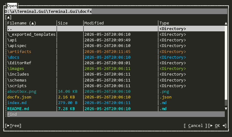
FileDialog
The base-class for OpenDialog and SaveDialog
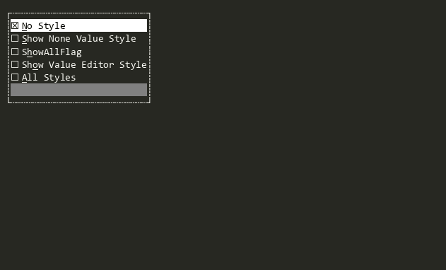
FlagSelector
Provides a user interface for displaying and selecting non-mutually-exclusive flags from a provided dictionary. FlagSelector<TFlagsEnum> provides a type-safe version where a [Flags] enum can be provided.
FlagSelector<T>
Provides a user interface for displaying and selecting non-mutually-exclusive flags in a type-safe way. FlagSelector provides a non-type-safe version. TFlagsEnum must be a valid enum type with the '[Flags]' attribute.
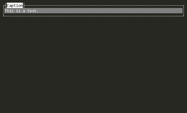
FrameView
A non-overlapped container for other views with a border and optional title.

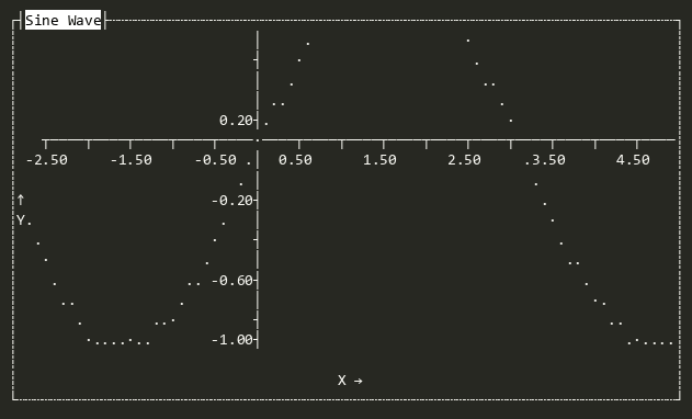
GraphView
Displays graphs (bar, scatter, etc.) with flexible labels, scaling, and scrolling.
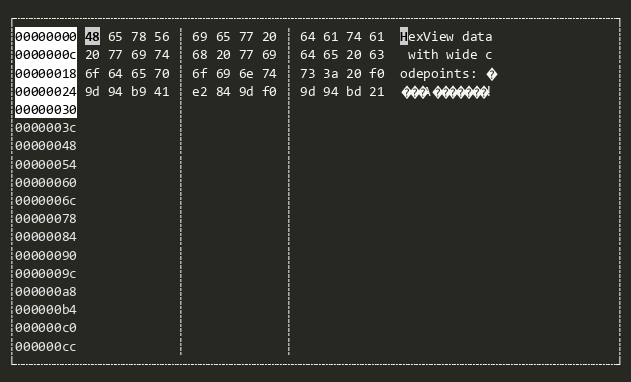
HexView
Provides a hex editor with the left side showing the hex values of the bytes in a Stream and the right side showing the contents (filtered to printable Unicode glyphs).
ImageView
Displays an image represented as a 2D array of Color pixels. Supports two rendering modes: cell-based (one colored space per pixel, works everywhere) and sixel-based (when the terminal supports it).
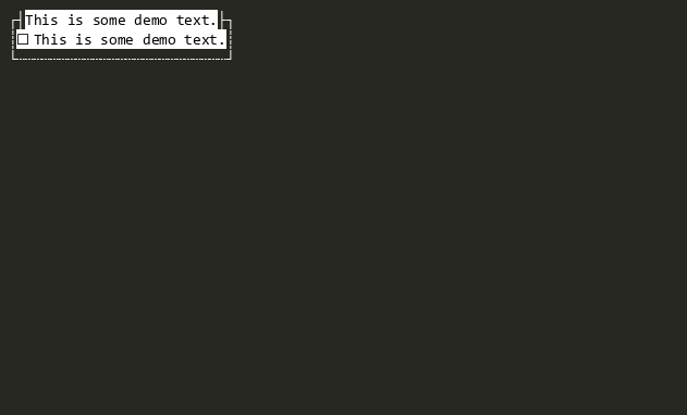
Label
Displays text that describes the View next in the SubViews. When the user presses a hotkey that matches the HotKey of the Label, the next View in SubViews will be activated.

LegendAnnotation
Used by GraphView to render symbol definitions in a graph, e.g. colors and their meanings
Line
Draws a single line using the LineStyle specified by Style.
LinearMultiSelector
Convenience non-generic LinearMultiSelector<T> closed over string. Allows designer scenarios (e.g. AllViewsTester) and reflection-based instantiation to discover and create the view without supplying a type argument.
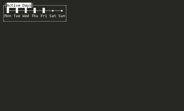
LinearMultiSelector<T>
A linear range view that allows selection of zero or more options from a typed list.
LinearRange
Convenience non-generic LinearRange<T> closed over string. Allows designer scenarios (e.g. AllViewsTester) and reflection-based instantiation to discover and create the view without supplying a type argument.
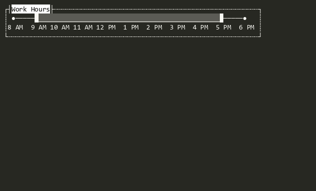
LinearRange<T>
A linear range view representing a contiguous range of options. The current value is a LinearRangeSpan<T> whose Kind is one of None, LeftBounded, RightBounded, or Closed.
LinearRangeViewBase<T>
Abstract base for linear range views (LinearSelector<T>, LinearMultiSelector<T>, LinearRange<T>) that present a list of typed options navigable by keyboard or mouse, and expose the current selection as a strongly-typed value via IValue<TValue>.
LinearSelector
Convenience non-generic LinearSelector<T> closed over string. Allows designer scenarios (e.g. AllViewsTester) and reflection-based instantiation to discover and create the view without supplying a type argument.
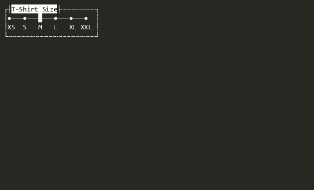
LinearSelector<T>
A linear range view that allows selection of a single option from a typed list of options.
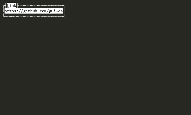
Link
Displays a clickable hyperlink with optional display text and a target URL.
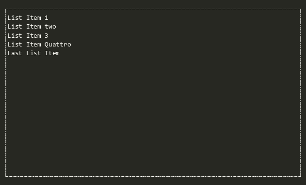
ListView
Provides a scrollable list of data where each item can be activated to perform an action.
ListView<T>
Provides a scrollable list of data where each item can be activated to perform an action, with a strongly-typed Value property that returns the selected object of type T from the underlying ObservableCollection<T>.
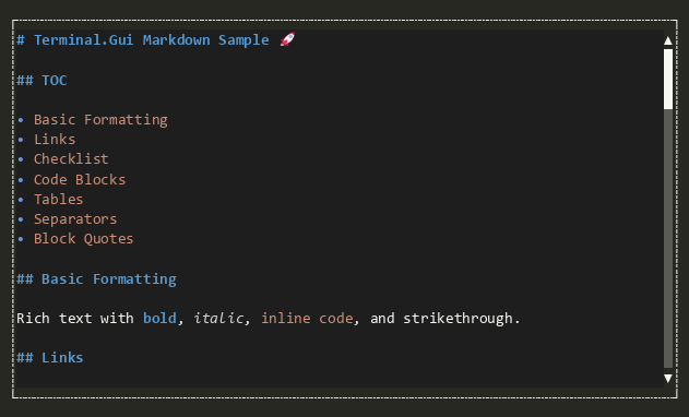
Markdown
A read-only view that renders Markdown-formatted text with styled headings, lists, links, code blocks, and more.
MarkdownCodeBlock
A read-only view that renders a single Markdown fenced code block with a dimmed background and an optional copy button.
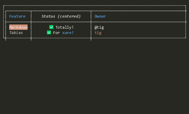
MarkdownTable
A read-only view that renders a single Markdown table with box-drawing borders via LineCanvas and styled header/body text with inline Markdown formatting.
Menu
A vertically-oriented Bar that contains MenuItem items, supporting cascading sub-menus, selection tracking, and the IValue<TValue> pattern.
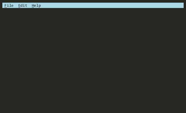
MenuBar
A horizontal Menu that contains MenuBarItem items. Each MenuBarItem owns a PopoverMenu that is displayed as a drop-down when the item is selected. Typically placed at the top of a window or view.
MenuBarItem
A MenuItem-derived item for use in a MenuBar. Each MenuBarItem holds either a PopoverMenu (modal, default) or an inline SubMenu (non-modal) that is displayed as a drop-down menu when the item is selected. The behavior is controlled by the UsePopoverMenu property.

MenuItem
A Shortcut-derived item for use in a Menu. Displays a command, help text, and key binding and supports nested SubMenus for cascading menu hierarchies.

NumericUpDown
Enables the user to increase or decrease an int by clicking on the up or down buttons.

NumericUpDown<T>
Enables the user to increase or decrease a value with the mouse or keyboard in type-safe way.
OpenDialog
Provides an interactive Dialog for selecting files or directories for opening

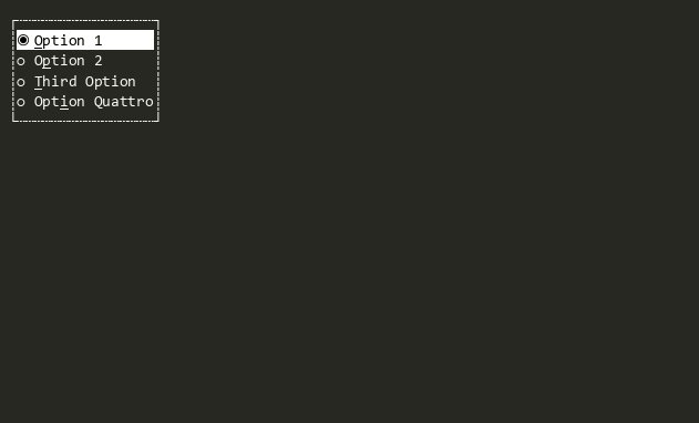
OptionSelector
Provides a user interface for displaying and selecting a single item from a list of options. Each option is represented by a checkbox, but only one can be selected at a time. OptionSelector<TEnum> provides a type-safe version where a enum can be provided.
OptionSelector<T>
Provides a user interface for displaying and selecting a single item from a list of options in a type-safe way. Each option is represented by a checkbox, but only one can be selected at a time. OptionSelector provides a non-type-safe version.
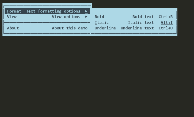
PopoverMenu
A IPopover-derived view that provides a cascading menu. Can be used as a context menu or a drop-down menu as part of MenuBar.
ProgressBar
A Progress Bar view that can indicate progress of an activity visually.
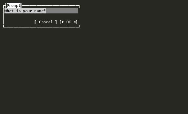
Prompt<T>
A dialog that wraps any View with Ok/Cancel buttons, extracting a typed result when the user accepts.
Runnable
Base implementation of IRunnable for views that can be run as blocking sessions without returning a result.
Runnable<T>
Base implementation of IRunnable<TResult> for views that can be run as blocking sessions.
RunnableWrapper<T>
Wraps any View to make it runnable with a typed result without adding dialog buttons.
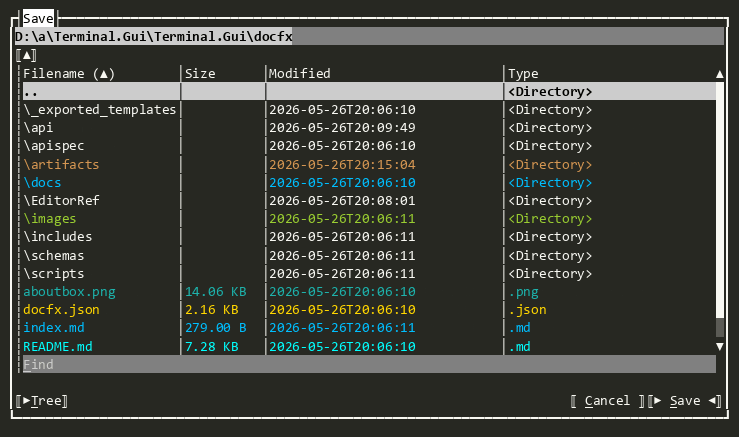
SaveDialog
Provides an interactive Dialog for selecting files or directories for saving
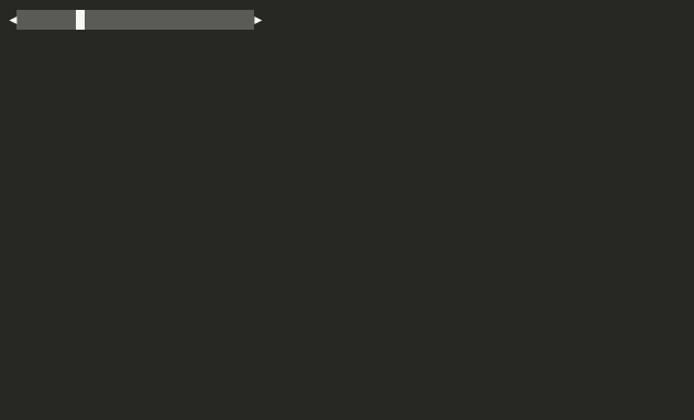
ScrollBar
Indicates the size of scrollable content and controls the position of the visible content, either vertically or horizontally. Two Buttons are provided, one to scroll up or left and one to scroll down or right. Between the buttons is a ScrollSlider that can be dragged to control the position of the visible content. The ScrollSlier is sized to show the proportion of the scrollable content to the size of the Viewport.
ScrollButton
A Button used to scroll content forward or backward. It enables mouse hold-repeat for continuous scrolling when the mouse button is held down. The button displays an arrow glyph determined by the combination of Direction and Orientation:
| Orientation | Direction | Glyph |
|---|---|---|
| Horizontal | Backward | LeftArrow |
| Horizontal | Forward | RightArrow |
| Vertical | Backward | UpArrow |
| Vertical | Forward | DownArrow |

ScrollSlider
Represents the proportion of the visible content to the Viewport in a ScrollBar. Can be dragged with the mouse, constrained by the size of the Viewport of it's superview. Can be oriented either vertically or horizontally.
SelectorBase
The abstract base class for OptionSelector<TEnum> and FlagSelector<TFlagsEnum>.
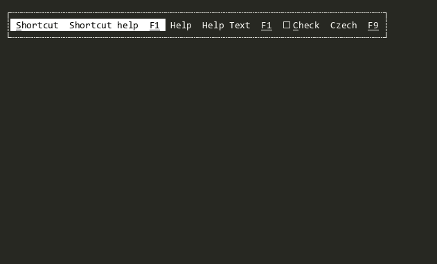
Shortcut
Displays a command, help text, and a key binding. Serves as the foundational building block for Bar, Menu, MenuBar, and StatusBar.
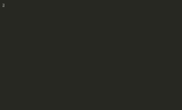
SpinnerView
Displays a spinning glyph or combinations of glyphs to indicate progress or activity
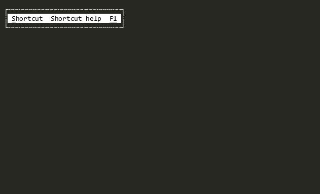
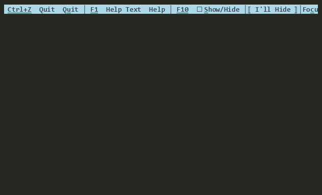
StatusBar
A status bar is a View that snaps to the bottom of the Viewport displaying set of Shortcuts. The StatusBar should be context-sensitive. This means, if the main menu and an open text editor are visible, the items probably shown will be ~F1~ Help ~F2~ Save ~F3~ Load. While a dialog to ask a file to load is executed, the remaining commands will probably be ~F1~ Help. So for each context must be a new instance of a status bar.
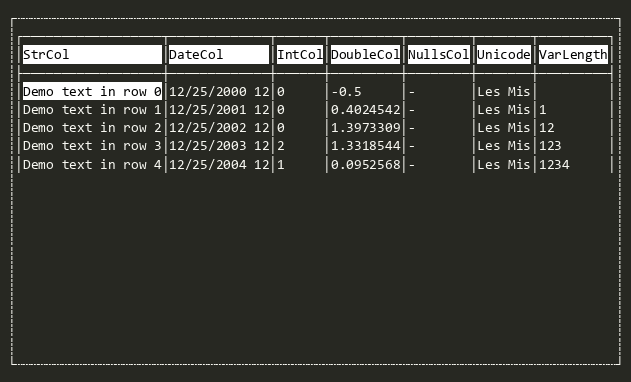
TableView
Displays and enables infinite scrolling through tabular data based on a ITableSource. See the TableView Deep Dive for more.
Tabs
A tabbed container View that renders each SubView as a selectable tab with a header drawn by Border. The currently focused SubView is the selected (front-most) tab.
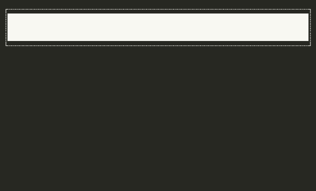
TextField
Single-line text editor.
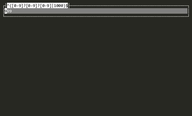
TextValidateField
Masked text editor that validates input through a ITextValidateProvider.
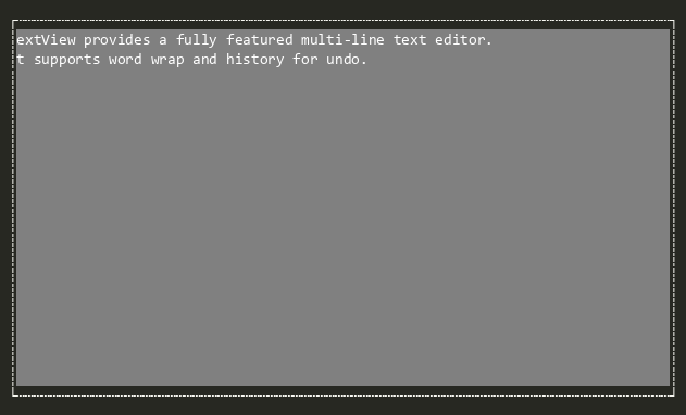
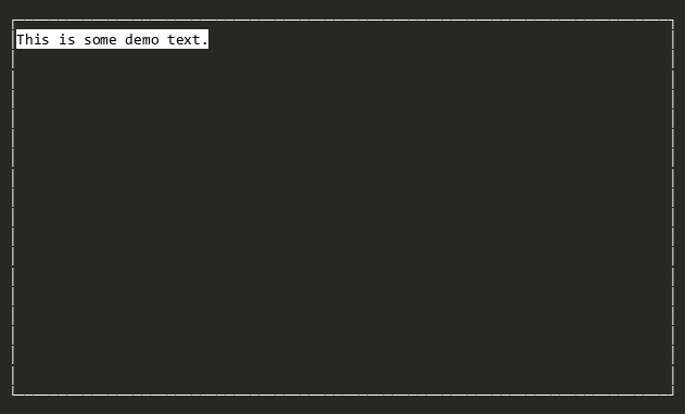
TextView
Fully featured multi-line text editor.
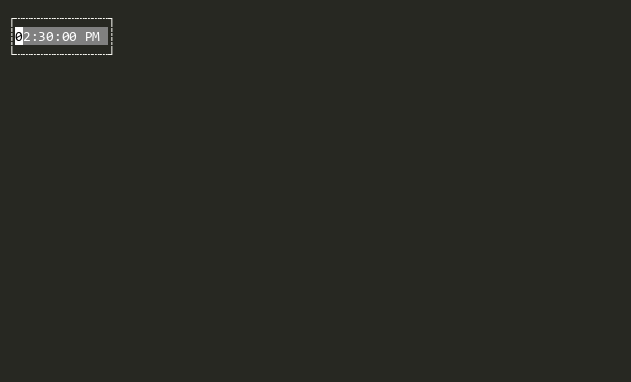
TimeEditor
Provides time editing functionality using TextValidateField with culture-aware formatting.
TreeView
Convenience implementation of generic TreeView<T> for any tree were all nodes implement ITreeNode. See TreeView Deep Dive for more information.
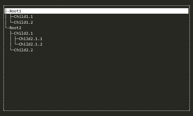
TreeView<T>
Hierarchical tree view with expandable branches. Branch objects are dynamically determined when expanded using a user defined ITreeBuilder<T>. See TreeView Deep Dive for more information.
Window
An overlapped container for other views with a border and optional title.
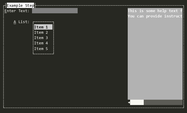
Wizard
A multi-step dialog for collecting related data across sequential steps.
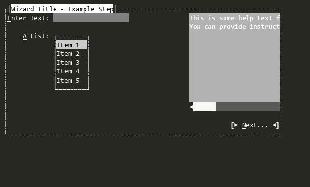
WizardStep
A single step in a Wizard. Can contain arbitrary Views and display help text in the right Padding.