Drawing (Text, Lines, and Color)
Terminal.Gui provides a set of APIs for formatting text, line drawing, and character-based graphing.
Drawing Taxonomy & Lexicon
| Term | Meaning |
|---|---|
| Attribute | Defines concrete visual styling for a visual element (Foreground color, Background color, TextStyle). |
| BackgroundColor | A property of Attribute describing the background text color. |
| Color | Base terminal color (supports TrueColor and named values like White, Black, Cyan, etc.). |
| ForegroundColor | A property of Attribute describing the foreground text color. |
| Glyph | A graphical representation of a character. |
| Rune | Unicode character. |
| Scheme | Maps VisualRole to Attribute, defining visual element appearance (color and style) based on semantic purpose. |
| Style | Property of Attribute for font-like hints (bold, italic, underline). |
| VisualRole | Semantic role/purpose of a visual element (Normal, Focus, HotFocus, Active, Disabled, ReadOnly). |
View Drawing API
Terminal.Gui apps draw using the Move() and AddRune() APIs. Move selects the column and row of the cell and AddRune places the specified glyph in that cell using the Attribute that was most recently set via SetAttribute(). The driver caches all changed Cells and efficiently outputs them to the terminal each iteration of the Application. In other words, Terminal.Gui uses deferred rendering.
Drawing Lifecycle
Drawing occurs during Application MainLoop iterations, not immediately when draw-related methods are called. This deferred rendering approach provides better performance and ensures visual consistency.
MainLoop Iteration Process
Each iteration of the Application MainLoop (throttled to a maximum rate) performs these steps in order:
- Layout - Views that need layout are measured and positioned (
LayoutSubviews()is called) - Draw - Views that need drawing update the driver's back buffer (
Draw()is called) - Write - The driver writes changed portions of the back buffer to the actual terminal
- Cursor - The driver ensures the cursor is positioned correctly with appropriate visibility
When Drawing Actually Occurs
- Normal Operation: Drawing happens automatically during MainLoop iterations when NeedsDraw or
SubViewNeedsDrawis set - Forced Update: LayoutAndDraw(bool) can be called to immediately trigger layout and drawing outside of the normal iteration cycle
- Testing: Tests can call
Draw()directly to update the back buffer, then callIDriver.Refresh()to output to the terminal
Important: Calling View.Draw() does not immediately update the terminal screen. It only updates the driver's back buffer. The actual terminal output occurs when the driver's Refresh() method is called, which happens automatically during MainLoop iterations.
Coordinate System for Drawing
The View draw APIs all take coordinates specified in Viewport-Relative coordinates. That is, 0, 0 is the top-left cell visible to the user.
See Layout for more details of the Terminal.Gui coordinate system.
Outputting unformatted text
- Moving the draw cursor using
Move(). - Setting the attributes using
SetAttribute(). - Outputting glyphs by calling
AddRune()orAddStr().
Outputting formatted text
- Adding the text to a TextFormatter object.
- Setting formatting options, such as
TextFormatter.Alignment. - Calling
TextFormatter.Draw()(Terminal.Gui.IDriver, System.Drawing.Rectangle,Terminal.Gui.Attribute,Terminal.Gui.Attribute,System.Drawing.Rectangle).
Line Drawing
See LineCanvas Deep Dive below.
View.Draw — Per-View Drawing Flow
When View.Draw() is called on a view that has NeedsDraw or SubViewNeedsDraw set, it executes these steps in order:
- Draw Adornments — Draws the Border and Padding frames (fills and line art). Non-transparent Margin is also drawn here. Transparent margins (those with shadows) are deferred to a second pass.
- Clip to Viewport — Sets the clip region to the view's Viewport, preventing content from drawing outside it.
- Clear Viewport — Fills the viewport with the background color.
- Draw SubViews — Draws SubViews in reverse Z-order (earliest added = highest Z = drawn last, on top). For SubViews with
SuperViewRendersLineCanvas = true, their LineCanvas is merged into the parent's canvas for unified intersection resolution. Overlapped SubViews' canvases are collected for painters'-algorithm compositing. - Draw Text — Renders
View.Textvia TextFormatter. - Draw Content — Raises
DrawingContent(overrideOnDrawingContentfor custom drawing). - Draw Adornment SubViews — Draws SubViews of Border and Padding (e.g., tab headers, diagnostic indicators). Their LineCanvas lines are merged into the parent's canvas.
- Render LineCanvas — Resolves all lines (including merged lines from adornments and SubViews) into glyphs via
GetCellMap, then composites overlapped canvases using the painters' algorithm. - Cache Clip for Margin — If the Margin has a shadow, the current clip is cached for the second-pass shadow render.
- DrawComplete & Clip Exclusion — Raises
DrawComplete. For opaque views, the entire frame is excluded from the clip. For transparent views, only the actually-drawn cells are excluded. This ensures later-drawn (lower-Z) views don't overwrite this view's content.
Peer-View Draw Loop
The static View.Draw(views, force) method orchestrates drawing a set of peer views (views sharing the same SuperView):
- Each peer view's
Draw()is called in order. - After all peers complete,
MarginView.DrawMargins()performs a second pass that draws transparent margins (shadows). This ensures shadows render on top of all other content. The cached clip from step 9 above is restored for each margin so the shadow draws into the correct region. NeedsDrawflags are cleared on all peers.
Declaring that Drawing is Needed
Call SetNeedsDraw() when something changes within a view's content area. Call SetNeedsLayout() when the viewport size needs recalculation. Both propagate up the view hierarchy via SubViewNeedsDraw.
Note: These methods do not cause immediate drawing. They mark the view for redraw in the next MainLoop iteration. To force immediate drawing (typically only in tests), call LayoutAndDraw(bool).
Overriding Draw Behavior
Most draw steps can be overridden using the Cancellable Work Pattern. For example, to prevent the viewport from being cleared, override OnClearingViewport() to return true, or subscribe to the ClearingViewport event and set Cancel = true.
Clipping
Clipping enables better performance and features like shadows by ensuring regions of the terminal that need to be drawn actually get drawn by the driver. Terminal.Gui supports non-rectangular clip regions with Region. The driver.Clip is the application managed clip region and is managed by Application. Developers cannot change this directly, but can use SetClipToScreen(), SetClip()(Terminal.Gui.Region), SetClipToFrame(), etc...
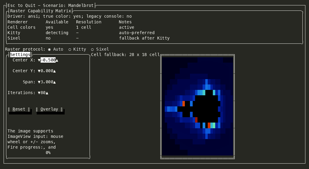
Raster Images (Kitty and Sixel)
Terminal.Gui can render raster images through the same deferred drawing pipeline as text and line art. ImageView accepts a Color[,] pixel buffer. When ImageView.UseRasterGraphics is true, the driver uses the best available terminal raster protocol:
- Kitty graphics, when KittyGraphicsSupport reports support and the output path has Kitty enabled.
- Sixel, when Kitty is not active and SixelSupport reports support.
- Cell rendering, when no raster protocol is available.
Kitty is preferred because it supports full RGBA pixels and works well in modern macOS terminals such as Kitty, Ghostty, and WezTerm. Sixel remains the fallback for terminals such as Windows Terminal and xterm. The obsolete ImageView.UseSixel and ImageView.IsUsingSixel members still work as compatibility shims; use UseRasterGraphics and IsUsingRasterGraphics in new code.
Raster image commands participate in normal composition:
- The current clip region is captured when the image is drawn.
- The output layer crops the pixel buffer to the visible clipped cell rectangles.
- The raster command is emitted before dirty text cells, so later-drawn SubViews, dialogs, borders, and overlays can paint over the image.
- Replacing or removing the image invalidates the cells the previous raster occupied, so stale terminal graphics are cleared by the next refresh.
To render an image, assign the pixel buffer and mark the view for drawing:
Color [,] pixels = new Color [1, 1];

ImageView imageView = new ()
{
    Width = 30,
    Height = 20,
    UseRasterGraphics = true
};

imageView.Image = pixels;
To customize Sixel encoding, assign ImageView.SixelEncoder before setting Image. Kitty output is encoded by the driver/output layer and does not use SixelEncoder.
The UICatalog Images scenario demonstrates runtime protocol selection, and the Mandelbrot scenario demonstrates a custom ImageView that re-renders fractal pixels while zooming and panning.
Cell
The Cell class represents a single cell on the screen. It contains a character and an attribute. The character is of type Rune and the attribute is of type Attribute.
Cell is not exposed directly to the developer. Instead, the driver classes manage the Cell array that represents the screen.
To draw a Cell to the screen, use Move() to specify the row and column coordinates and then use the AddRune() method to draw a single glyph.
Attribute
The Attribute class represents the formatting attributes of a Cell. It exposes properties for the foreground and background colors as well as the text style. The foreground and background colors are of type Color. Bold, underline, and other formatting attributes are supported via the Attribute.Style property.
Use SetAttribute() to indicate which Attribute subsequent AddRune() and AddStr() calls will use:
// This is for illustration only. Developers typically use SetAttributeForRole instead.
SetAttribute (new Attribute (Color.Red, Color.Black, Style.Underline));
AddStr ("Red on Black Underlined.");
In the above example a hard-coded Attribute is set. Normally, developers will use SetAttributeForRole() to have the system use the Attributes associated with a VisualRole (see below).
// Modify the View's Scheme such that Focus is Red on Black Underlined
SetScheme (new Scheme (Scheme)
    {
        Focus = new Attribute (Color.Red, Color.Black, Style.Underline)
    });

SetAttributeForRole (VisualRole.Focus);
AddStr ("Red on Black Underlined.");
Color
Terminal.Gui supports 24-bit true color (16.7 million colors) via the Color struct. The Color struct represents colors in ARGB32 format, with separate bytes for Alpha (transparency), Red, Green, and Blue components.
Standard Colors (W3C+)
Terminal.Gui provides comprehensive support for W3C standard color names plus additional common terminal colors via the StandardColor enum. This includes all standard W3C colors (like AliceBlue, Red, Tomato, etc.) as well as classic terminal colors (like AmberPhosphor, GreenPhosphor).
Colors can be created from standard color names:
var color1 = new Color(StandardColor.CornflowerBlue);
var color2 = new Color(StandardColor.Tomato);
var color3 = new Color("Red");  // Case-insensitive color name parsing
Standard colors can also be parsed from strings:
if (Color.TryParse("CornflowerBlue", out Color color))
{
    // Use the color
}
Alpha Channel and Transparency
While Color supports an alpha channel for transparency (values 0-255), terminal rendering does not currently support alpha blending. The alpha channel is primarily used to:
- Indicate whether a color should be rendered at all (alpha = 0 means fully transparent/don't render)
- Support future transparency features
- Enable terminal background pass-through (see #2381 and #4229)
Important: When matching colors to standard color names, the alpha channel is ignored. This means Color(255, 0, 0, 255) (opaque red) and Color(255, 0, 0, 128) (semi-transparent red) will both be recognized as "Red". This design decision supports the vision of enabling transparent backgrounds while still being able to identify colors semantically.
var opaqueRed = new Color(255, 0, 0, 255);
var transparentRed = new Color(255, 0, 0, 0);

// Both will resolve to "Red"
ColorStrings.GetColorName(opaqueRed);      // Returns "Red"
ColorStrings.GetColorName(transparentRed); // Returns "Red"
Color.None (Terminal Default Colors)
Color.None is a special sentinel value (alpha=0) that tells the driver to emit ANSI reset codes (CSI 39m / CSI 49m) instead of explicit RGB values. This allows the terminal's native foreground/background colors — including any transparency or acrylic effects — to show through.
When Color.None is used in a Scheme, the derivation algorithm resolves it to the terminal's actual default colors (detected via OSC 10/11 queries at startup) before performing color math. See Scheme Deep Dive for details.
Dark/Light Background Awareness
The Color.IsDarkColor() method returns true if a color's HSL lightness is below 50%. This is used by the Scheme derivation algorithm to determine the direction for GetBrighterColor and GetDimmerColor:
Color.GetBrighterColor(double, bool?)— Makes a color more visually prominent. On dark backgrounds (or when auto-detecting), increases lightness. On light backgrounds, decreases lightness.Color.GetDimmerColor(double, bool?)— Makes a color less visually prominent. On dark backgrounds, decreases lightness. On light backgrounds, increases lightness (washes out toward white).
Both methods accept an optional isDarkBackground parameter. When null (the default), they auto-detect from the color's own lightness for backward compatibility. The Scheme derivation algorithm passes explicit values based on the resolved background color.
Legacy 16-Color Support
For backwards compatibility and terminals with limited color support, Terminal.Gui maintains the legacy 16-color system via ColorName16. When true color is not available or when Application.Force16Colors is set, Terminal.Gui will map true colors to the nearest 16-color equivalent.
VisualRole
Represents the semantic visual role of a visual element rendered by a View (e.g., Normal text, Focused item, Active selection).
VisualRole provides a set of predefined VisualRoles:
namespace Terminal.Gui.Drawing;

/// <summary>
///     Represents the semantic visual role of a visual element rendered by a <see cref="View"/>. Each VisualRole maps to
///     a property of <see cref="Scheme"/> (e.g., <see cref="Scheme.Normal"/>).
/// </summary>
/// <remarks>
///     A single View may render as one or multiple elements. Each element can be associated with a different
///     <see cref="VisualRole"/>.
/// </remarks>
public enum VisualRole
{
    /// <summary>
    ///     The default visual role for unfocused, unselected, enabled elements.
    /// </summary>
    Normal,

    /// <summary>
    ///     The visual role for <see cref="Normal"/> elements with a <see cref="View.HotKey"/> indicator.
    /// </summary>
    HotNormal,

    /// <summary>
    ///     The visual role when the element is focused.
    /// </summary>
    Focus,

    /// <summary>
    ///     The visual role for <see cref="Focus"/> elements with a <see cref="View.HotKey"/> indicator.
    /// </summary>
    HotFocus,

    /// <summary>
    ///     The visual role for elements that are active or selected (e.g., selected item in a <see cref="ListView"/>). Also
    ///     used
    ///     for headers in, <see cref="HexView"/>, <see cref="CharMap"/>.
    /// </summary>
    Active,

    /// <summary>
    ///     The visual role for <see cref="Active"/> elements with a <see cref="View.HotKey"/> indicator.
    /// </summary>
    HotActive,

    /// <summary>
    ///     The visual role for elements that are highlighted (e.g., when the mouse is inside over a <see cref="Button"/>).
    /// </summary>
    Highlight,

    /// <summary>
    ///     The visual role for elements that are disabled and not interactable.
    /// </summary>
    Disabled,

    /// <summary>
    ///     The visual role for elements that are editable (e.g., <see cref="TextField"/>).
    /// </summary>
    Editable,

    /// <summary>
    ///     The visual role for elements that are normally editable but currently read-only.
    /// </summary>
    ReadOnly,

    /// <summary>
    ///     The visual role for preformatted or source code content (e.g., <see cref="MarkdownCodeBlock"/>, inline code).
    ///     If not explicitly set, derived from <see cref="Editable"/> with a dimmed background and bold style.
    /// </summary>
    Code,

    /// <summary>The visual role for source-code comments.</summary>
    CodeComment,

    /// <summary>The visual role for source-code keywords.</summary>
    CodeKeyword,

    /// <summary>The visual role for source-code string literals.</summary>
    CodeString,

    /// <summary>The visual role for source-code numeric literals.</summary>
    CodeNumber,

    /// <summary>The visual role for source-code operators.</summary>
    CodeOperator,

    /// <summary>The visual role for source-code type names.</summary>
    CodeType,

    /// <summary>The visual role for source-code preprocessor directives.</summary>
    CodePreprocessor,

    /// <summary>The visual role for source-code identifiers.</summary>
    CodeIdentifier,

    /// <summary>The visual role for source-code constants.</summary>
    CodeConstant,

    /// <summary>The visual role for source-code punctuation.</summary>
    CodePunctuation,

    /// <summary>The visual role for source-code function names.</summary>
    CodeFunctionName,

    /// <summary>The visual role for source-code attributes.</summary>
    CodeAttribute
}
Schemes
A Scheme is named a mapping from VisualRoles (e.g. VisualRole.Focus) to Attributes, defining how a View should look based on its purpose (e.g. Menu or Dialog). @Terminal.Gui.SchemeManager.Schemes is a dictionary of Schemes, indexed by name.
A Scheme defines how Views look based on their semantic purpose. The following schemes are supported:
| Scheme Name | Description |
|---|---|
| Base | The base scheme used for most Views. |
| Dialog | The dialog scheme; used for Dialog, MessageBox, and other views dialog-like views. |
| Error | The scheme for showing errors, such as in ErrorQuery. |
| Menu | The menu scheme; used for Terminal.Gui.Menu, MenuBar, and StatusBar. |
| Accent | The accent scheme; a secondary/alternate scheme for visual distinction. Used for panels, event logs, and any view that needs visual separation. |
@Terminal.Gui.SchemeManager manages the set of available schemes and provides a set of convenience methods for getting the current scheme and for overriding the default values for these schemes.
Scheme dialogScheme = SchemeManager.GetScheme (Schemes.Dialog);
ConfigurationManager can be used to override the default values for these schemes and add additional schemes.
See Scheme Deep Dive for more details.
Text Formatting
Terminal.Gui supports text formatting using TextFormatter. TextFormatter provides methods for formatting text using the following formatting options:
- Horizontal Alignment - Left, Center, Right
- Vertical Alignment - Top, Middle, Bottom
- Word Wrap - Enabled or Disabled
- Formatting Hot Keys
Glyphs
The Glyphs class defines the common set of glyphs used to draw checkboxes, lines, borders, etc... The default glyphs can be changed per-ThemeScope via ConfigurationManager.
LineCanvas Deep Dive
What LineCanvas Does
Terminal UI borders are built from Unicode box-drawing characters: ─, │, ┌, ┐, ┼, ├, and dozens more. When two borders meet, the correct junction glyph must be selected. Doing this by hand is tedious and error-prone.
LineCanvas solves this. You describe lines — start point, length, orientation, style — and the canvas automatically resolves every intersection into the correct Unicode glyph. Where a horizontal and vertical line meet, it produces a ┼. Where three lines meet, a ├. Corners, T-junctions, and crosses are all handled automatically.
Basic Usage
LineCanvas lc = new ();

// Draw a 10-cell horizontal line
lc.AddLine (new Point (0, 0), 10, Orientation.Horizontal, LineStyle.Single);

// Draw a 5-cell vertical line crossing at (4, 0)
lc.AddLine (new Point (4, 0), 5, Orientation.Vertical, LineStyle.Single);

// Resolve all intersections and get the glyphs
Dictionary<Point, Cell?> cells = lc.GetCellMap ();
// At (4, 0), this returns a ┬ (top-tee), not a ─ or │
Each StraightLine is always horizontal or vertical. It has a Start point, a Length (positive = right/down, negative = left/up, zero = a single junction point), an Orientation, a LineStyle, and an optional color Attribute.
How Intersection Resolution Works
When you call GetCellMap(), the canvas walks every point within its bounds:
Collect intersections. For each point, every line that passes through it produces an
IntersectionDefinitiondescribing how the line relates to that point — does it pass over horizontally? Start here going right? End here from below?Determine glyph type. The set of intersection types at a point is analyzed to decide the glyph category: corner, T-junction, cross, straight line, etc. For example,
{StartRight, StartDown}= upper-left corner (┌).Select style variant. The LineStyle of the intersecting lines determines which Unicode variant to render: single (
─), double (═), heavy (━), dashed, dotted, or rounded.Filter exclusions. Points in the exclusion region (see Exclude below) are removed from the output.
Line Styles
LineStyle determines the glyph variant used for each line segment and intersection:
| Style | Horizontal | Vertical | Corner |
|---|---|---|---|
Single |
─ |
│ |
┌ |
Double |
═ |
║ |
╔ |
Heavy |
━ |
┃ |
┏ |
Rounded |
─ |
│ |
╭ |
Dashed |
╌ |
╎ |
┌ |
Dotted |
┄ |
┆ |
┌ |
When lines of different styles intersect, the canvas selects the appropriate mixed-style glyph (e.g., a single horizontal meeting a double vertical produces ╥).
Merging Canvases Across Views
Every View has its own LineCanvas. During drawing, the framework merges canvases so that lines from different views auto-join seamlessly.
When SuperViewRendersLineCanvas is true on a SubView, its lines are merged into the SuperView's canvas via LineCanvas.Merge(). All lines then participate in a single intersection-resolution pass. This is how adjacent tab headers, nested frames, and other multi-view border compositions achieve connected line art.
SubViews that render their own LineCanvas independently (the default) are composited using a painters' algorithm during View.RenderLineCanvas(). Higher-Z views take priority; lower-Z cells only render if they provide richer junctions.
LineStyle.None — A Convention, Not an Eraser
None has no special handling inside LineCanvas. When passed to AddLine, the line is stored and participates in intersection resolution like any other. Because None doesn't match any styled-glyph check, it falls through to the default glyphs and renders identically to LineStyle.Single.
The "eraser" behavior in the LineDrawing scenario is implemented by the consumer, not by LineCanvas:
// LineDrawing scenario — eraser logic on mouse-up
if (_currentLine.Style == LineStyle.None)
{
    // Physically remove overlapping segments from the line collection
    area.CurrentLayer = new LineCanvas (
        area.CurrentLayer.Lines.Exclude (
            _currentLine.Start,
            _currentLine.Length,
            _currentLine.Orientation));
}
This calls Exclude to split and remove overlapping lines. The None-styled line itself is never kept.
Key point: If you add a
LineStyle.Noneline without eraser handling, it renders as a visible single-style line. To suppress lines, use the mechanisms described below.
Suppressing and Removing Lines
LineCanvas provides three distinct mechanisms for controlling what gets drawn. Each operates at a different stage and has different semantics. Using the wrong one produces subtle bugs.
LineCanvas.Exclude — Output Filter
Exclude suppresses resolved cells from GetCellMap output without affecting the underlying geometry. Lines still exist and still auto-join through excluded positions.
LineCanvas lc = new ();
lc.AddLine (new (0, 0), 10, Orientation.Horizontal, LineStyle.Single);

// Exclude positions 3–5 (a title label occupies those cells)
lc.Exclude (new Region (new Rectangle (3, 0, 3, 1)));

// GetCellMap returns 7 cells (positions 0–2 and 6–9).
// The line auto-joins correctly on either side because
// the full line still participates in intersection resolution.
Use this when something else is drawn at a position — for example, a title label on a border. The border joins correctly on either side because the line is continuous behind the label.
Do not use this as an eraser. Because lines auto-join through excluded regions, phantom geometry leaks into junction decisions. A vertical line crossing an excluded horizontal line resolves as ┼ instead of │.
Reserve — Compositing Metadata
Reserve marks positions as intentionally empty for multi-canvas compositing. It has no effect on the canvas that calls it — GetCellMap does not check reserved cells.
Reserved cells are consumed during View.RenderLineCanvas, which layers multiple independently-resolved canvases. Reserved cells claim positions so that cells from lower-Z canvases do not show through:
// In a focused tab's border rendering:
// Reserve the gap where the header connects to the content area.
// This prevents the content area's top border from showing through.
lc.Reserve (new Rectangle (gapStart, borderY, gapWidth, 1));
StraightLineExtensions.Exclude — Geometry Surgery
Exclude physically splits or removes lines from a collection. This is the correct tool for erasing geometry:
LineCanvas lc = new ();
lc.AddLine (new (0, 0), 10, Orientation.Horizontal, LineStyle.Single);

// Erase positions 4–5 by rebuilding the line collection
IEnumerable<StraightLine> remaining = lc.Lines.Exclude (
    new Point (4, 0), 2, Orientation.Horizontal);

LineCanvas erased = new (remaining);
// erased contains two separate segments: 0–3 and 6–9.
// A vertical line through x=4 correctly renders as │, not ┼.
Warning: There are two unrelated methods named
Exclude.LineCanvas.Exclude (Region)filters output while preserving auto-join.StraightLineExtensions.Exclude (...)physically removes geometry. They have opposite semantics.
Choosing the Right Mechanism
| Scenario | Mechanism | Why |
|---|---|---|
| Hide cells behind a title label | LineCanvas.Exclude (Region) |
Lines auto-join through the label — the border looks continuous |
| Erase drawn lines | StraightLineExtensions.Exclude (...) |
Geometry is physically removed — no phantom junctions |
| Gap where a focused tab meets content | Reserve (Rectangle) |
Claims positions during compositing so lower-Z borders don't bleed through |
| "No border" on a view | Don't call AddLine |
Check if (style != LineStyle.None) before adding |
Thickness
Describes the thickness of a frame around a rectangle. The thickness is specified for each side of the rectangle using a Thickness object. The Thickness class contains properties for the left, top, right, and bottom thickness. The AdornmentImpl class uses Thickness to support drawing the frame around a view.
See View Deep Dive for details.
Diagnostics
The ViewDiagnosticFlags.DrawIndicator flag can be set on View.Diagnostics to cause an animated glyph to appear in the Border of each View. The glyph will animate each time that View's Draw method is called where either NeedsDraw or SubViewNeedsDraw is set.
Accessing Application Drawing Context
Views can access application-level drawing functionality through View.App:
public class CustomView : View
{
    protected override bool OnDrawingContent()
    {
        // Access driver capabilities through View.App
        if (App?.Driver?.SupportsTrueColor == true)
        {
            // Use true color features
            SetAttribute(new Attribute(Color.FromRgb(255, 0, 0), Color.FromRgb(0, 0, 255)));
        }
        else
        {
            // Fallback to 16-color mode
            SetAttributeForRole(VisualRole.Normal);
        }

        AddStr("Custom drawing with application context");
        return true;
    }
}